The Impact of Retail Store Appearance

Subscribe to our newsletter
Updated July 19, 2023
How to drag shoppers away from their phones and make them walk into your store? Bump up your curb appeal to greatly impact your store's appearance.
In the time before the pandemic, store appearance was something most big brands spent millions on.
From the access to their parking lots, the exterior finish, the channel letters of the sign to the details of nested, round merchandising tables in greige, the recycled materials on the floors to the digital capabilities in the fitting rooms, there was plenty of attention to stand out.
With the advent of the pandemic, many advocated an abandonment of those defining features, including retail merchandising, so customers could “get in and get out.” Furthermore, retailers embraced the meager benefit of curbside pickup out of necessity. While others will tell you this is the way forward to the “next normal,” I am telling you that is a mistake.
Post-pandemic, If you are still focusing on curbside pickup expansion, know you are losing at least 50% of your add-on and impulse sales because designated pickup areas make zero impact on a shopper.
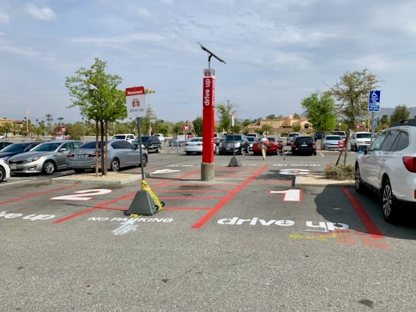
Retail has always been a game of being brilliant on the basics when it comes to store appearance, but there is an even greater urgency now to create an exceptional visual experience for all your shoppers.
Here's what a store's appearance communicates to customers
Within a few seconds of seeing a brick-and-mortar store — whether from the parking lot or from the street— shoppers decide on numerous things, from how much attention is paid to detail to the type of shopper who is welcome there and even to how susceptible the store is to shoplifting.
We know immediately whether we will feel comfortable walking into a store if the store will have something that surprises and delights us, and even the level of customer service we will receive.
The external image for every type of store is different; with big-box outlets, it is just size that makes you think they have everything you need, and on the opposite side are the boutiques whose windows showcase a curated selection for their particular niche. Think how different a bike store is compared to an Eileen Fisher store; different, but you instantly know what you will find there.
You don’t open the door to the Eileen Fisher store and find Yankee jerseys. Your store's exterior and display windows need to communicate to your shoppers exactly what type of clothing, sport, hobby, or home goods they will find in your store.
Customers have always noticed how well a building is being maintained, whether it has chipped paint, worn doors, missing lights, or general uncleanliness. They don’t want to see employees smoking out front or trash or debris in parking lots or on sidewalks.
But with the pandemic, retailers had the added responsibility of showcasing health and safety, so the impact of their store atmosphere came off as clean and safe. A spotless retail store must also have had, at a minimum, the requirement for social distancing, plexiglass separations between cashier and shopper, sanitizing, and masks.
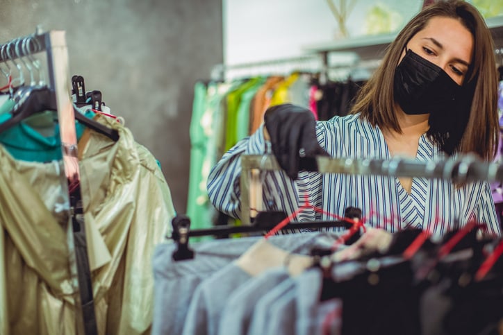
More advanced ways to maintain health and safety going forward include contactless payment options like tap-and-go credit cards, Apple Pay, Afterpay, and more.
Even if you have vacancies around you on Main Street or in the mall, get landlords to put art, displays, or something in vacant windows so the view from the street is inviting.
Inside, great displays of merchandise, even if not well-stocked but with easy-to-understand signage, help ground the shopper not just to go in and get what they need.
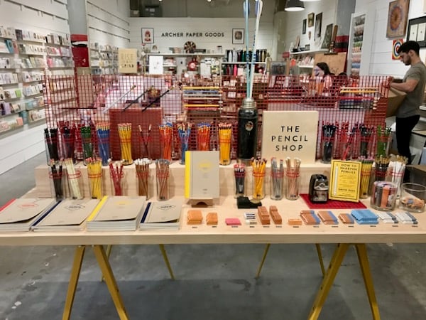
On the contrary, a store that has a haphazard organization adds stress and anxiety to shoppers. They wonder, “Where can I find what I’m looking for? What is this? Can someone help me?”
Worse, they can get in trouble trying to do it themself...
Once I got kicked out of and banned from a local Home Depot because I wanted a lawnmower that was in stock on the top shelf but couldn’t find a store associate to help me so I got on one of their forklifts and got it down myself. I did not know that I was not supposed to do that.
— Ryan, Perdido en TX (@RyanLostinTX) June 25, 2020
Even in a consignment or resale store, organization is key to not wasting shoppers’ time. Most shoppers who go out of their homes will want to see what you have to offer.
Without organization and a clear method to your visual merchandising, store organization, signage, and traffic flow, they will find it feels like work to shop with you.
Here’s an example from a grocery store in Portland with too many messages and signs on top of signs.
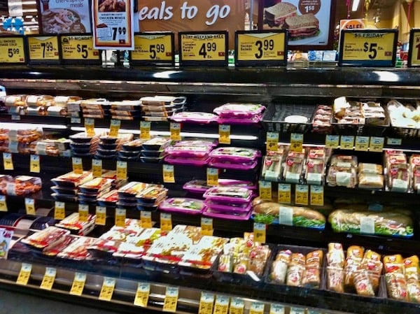
Now look at an organized store...
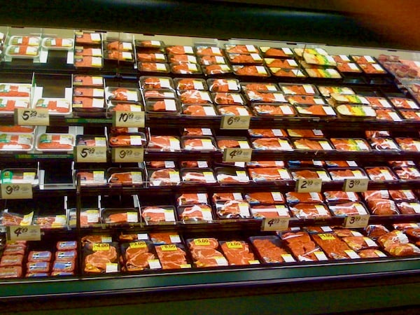
It is the product that makes an impact, not the signage. The signage actually gets in the way of the prior example. The product also stimulates desire. It draws the shopper to the display to look at the variety.
Much like a well-merchandised apparel store, the consumer considers the purchase based on looks more than the price.
Remove those vendor-supplied fixtures in the middle of your aisles. They create bottlenecks for shoppers and can thwart social distancing.
I started selling western wear to yuppies in Santa Monica in the 80s. We had so much merchandise that racks were jammed together, and sight lines were compromised. It wasn’t just bad for shoppers; it made it possible for our store to be cleaned out of Levi 501s by a ring of shoplifting professionals.
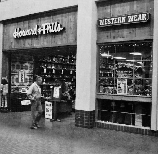
Shoppers won’t tell you your store lacks impact or organization; they will leave empty-handed. When fewer shoppers visit brick-and-mortar stores, your efforts have to be to attract new customers - and you can’t afford to turn off even a few.
A great store layout gives the shopper a feeling of wonder, not just the satisfaction of buying.
That’s why paying particular attention to giving a positive perception of the visual cues customers respond to during this pandemic is essential. But the outside appearance of your store has to draw them in first.
Importance of an attractive storefront
An attractive feature of a storefront should be an obvious place to enter. Car dealerships have learned putting a square around the front doors has increased visits and helped attract customers.
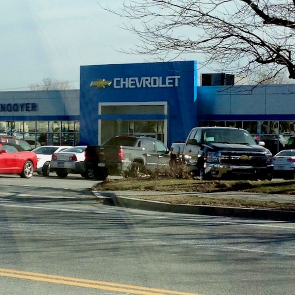
The area around your front doors should be clean and grab a casual shopper’s eyes.
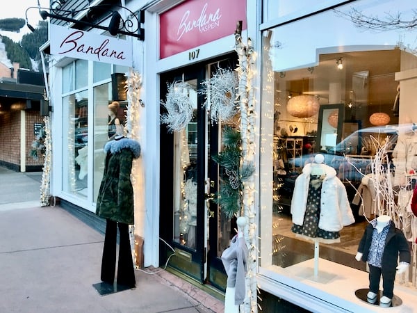
The visual merchandising of your front windows needs to be curated to a few related items and not trying to show all you have. As you look for ideas on decorating windows, remember that the lighting and main item should be at eye level.
A new customer is still looking for something to stand out, even during the pandemic.
Not only will an attractive storefront improve your business, but it will also add to your company culture. An exciting storefront tells your employees, “It’s different here.” It also signals to associates that they aren’t just working for anyone but for a store focused on the customer.
That will lead to a willingness to care about working to maintain a healthy and clean store.
My friend Peter went to the Apple Store in Grand Central Station. Their new health and safety protocol to enter the store without an appointment was explained at the entrance. Apple clearly displayed its policy, and he was asked questions about his health. At Level 2, overlooking the main concourse, his temperature was taken. He was then escorted to another Apple employee who escorted him to the socially-distant line to wait at the Genius Bar.
That feeling of professionalism and customer service made him “feel pampered rather than challenged by the rules.”
That pride in caring for your shoppers and customers also shows in your store exterior…
Anthropologie’s visual merchandising is legendary; each store’s windows are original but simple to understand and carefully thought out by their individual visual merchandising departments. Take a look at this New York City location.
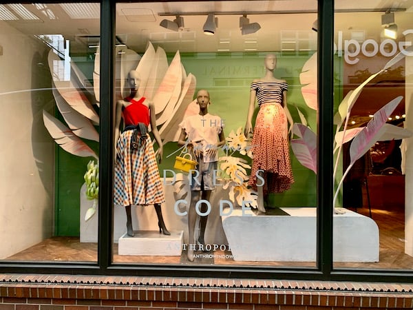
But once shoppers see your amazing storefront, how do you get them to buy?
How to increase your store foot traffic by improving your store's display and appearance
First off, it is important not to guess about your foot traffic. A retailer can use a third-party company that monitors traffic using cameras or light beams. You can also use a sophisticated service like ShopperTrak with multiple sensors. If you’re too small for those, you can always make hash marks on a piece of paper for each individual that walks in during a set time.
The main goal of understanding foot traffic is to see how much opportunity is actually coming in the doors. Many times, associates and managers say, “We’re slow,” and do not realize they had plenty of opportunities they didn’t recognize.
But the key to foot traffic is to relate the number of shoppers who entered to the number of customers who purchased. That percentage is referred to as the conversion rate.
Window displays are even more critical in getting shoppers to purchase impulsively and add incremental items to the list they walked in the door with. Proper visual merchandising can stop a shopper in their tracks. That display converted your foot traffic of lookers into buyers.
But merchandise can only do so much. The real magic is in having a very visible personable staff who can go beyond being nice and encourage the shopper to try the item on, to treat themselves, to compare and contrast similar products, and add-on or suggestively sell (link to How to Boost Retail Sales with suggestive selling) additional products.
To boost foot traffic, look at your online reviews to see how your store's appearance affects shoppers. Here’s an example from Texas, “I walked through the place for at least 10 minutes before I even saw anybody. It smells old and not fresh inside. I didn't feel welcome here.”
Showcasing your store’s appearance extends to social media as well. Social media shares are an important channel to bring shoppers into your store through live videos, tours of new products, or influencer promotions in your physical store. Make sure your appearance is professional, speak clearly and slowly, and showcase your items in the best light and angles possible.
How to achieve a more attractive storefront
Whatever your store design, make sure it is cleaned regularly. That goes beyond cleaning off handprints on the front doors and sanitizing regularly; it includes washing your awnings and mats, ensuring your planters are full of growing plants and not trash, and ensuring any chips in paint or materials are fixed on an ongoing basis.
An effective storefront sign is easy to read at the speed limit on your street. Channel letters that are lit from behind do this best. Pay attention to retail trends and digital displays as well.
Five ways you can make your storefront more appealing right now:
- Paint, light, or otherwise highlight your front doors.
- Install planters on either side of your doors.
- Put out a “Welcome” mat.
- Create an eye-catching window display
- Add motion to your window – even spinning pinwheels near a fan can work wonders.
How can you evaluate the effectiveness of your storefront? If you have studied how to attract the eye of the casual pedestrian or car in traffic, you should hear people telling you how much they liked the window, why they came in, or hopefully, they’ll buy what you featured in the window. And remember, their comments on social media count too.
The key to making an impact is to duplicate it repeatedly so your shop never feels old or stale but surprises your loyal customers as much as newcomers.
And don’t forget about your digital store as well. You can make a big impact using PopShop Live.
See also, How Your Merchandising Can Influence Customers To Increase Retail Sales
In Sum
Retailers have to give people a reason to visit that is so impactful from the outside appearance that it justifies stopping and opening the door to enter.
It can be as simple as improving your outdoor aesthetic followed by correct retail merchandising inside.
SalesRX has a whole course on merchandising included. Download the course descriptions below.


