Influence Customers With Retail Merchandising for Higher Sales

Subscribe to our newsletter
Updated August 7, 2024
There was a time when great merchandising was a valuable tool in a retailer’s arsenal against competitors. Then, it became a cost-saving area.
Retailers are rethinking their stores' experiential shopping experience, and great merchandising is becoming relevant again.
Merchandising is one of the most impactful strategies for influencing brick-and-mortar consumers and causing them to pause and consider.
In an effective display, all the necessary elements are there: curated product, featured spots, and well-lit props of appropriate size, all in a limited color palette.
The trends I'm sharing include some of the most exciting store designs ever.
Shopping isn’t an either-or...
Many people shop online using Amazon but still shop in brick-and-mortar stores —and they will for the foreseeable future.
When they’re online, customers can’t emotionally connect to the merchandise. And let’s be honest; they’re probably just searching for the cheapest example of what they’re looking for.
Discover How to craft a retail merchandising plan with this comprehensive primer
When they make an effort to visit a brick-and-mortar store, your first chance to say it’s different here is through your display skills and how your store focuses their attention.
Then, they aren’t just looking for the cheapest but are open to having an emotional connection with your products that they can touch, hold, and try on.
Online can’t deliver the same experience
Now, I know some would consider visual merchandising old-school. After all, it’s not as sexy as a pair of virtual reality goggles or as cutting-edge as a robot.
But let’s be honest: Most of those in-store tools have not been proven to increase shopper conversions; they’re just new and popular topics of conversation.
As Tom Redd, VP at SAP, recently said about such shiny objects,
“In reality, today, real customers are not fitting into the mold created by these tech people and magazine articles that preach no stores and no clerks — Comic-Con retail.”
Those shoppers must be shaken from their digital cocoons when they enter your store.
OK, Bob, what can I do about my sales and merchandising?
Glad you asked...
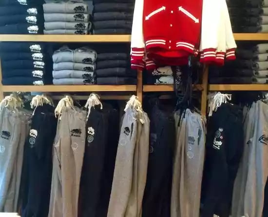
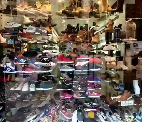
First, a great display window or merchandised wall reduces customers' choices. Poorly merchandised windows or walls make customers feel overwhelmed.
It’s the difference between this Roots store in Canada ...
... versus this cluttered window in New York.
High-converting displays don’t just happen
Just like selling, you can’t just wing it. If you’re new to visual merchandising training, check out my post 12 Insights How To Merchandise Your Store.
Going beyond those tips, the key is to get your messaging right.
What do you want your shoppers to do when they see your display?
Play the video? Try it on? Pick it up?
Then tell them so!
I see so many displays that lack focus. That happens because the person who made the display didn’t know what they wanted the shopper to do.
To ensure that doesn’t happen to you, describe what your collection of products in the display will do for the consumer.
Not sure how? It's easy. Ask customers who buy those items, “Why did you buy these today?” The more answers you hear, the clearer you’ll be about real customers' benefits from purchasing.
The merchandise can only do so much with obvious relationships, so consider signage that shows a system. You have to put into a few words or icons what would usually take you several sentences to say.
To get the message right, think like a customer
- What will I need to make this work?
- What else can I use with it?
- What else can I use it for?
- What additional items will I need?
This becomes your system of displaying your products.
Here's an example of a paint store:
You have a display of a gallon of house paint, a brush, and a paint can opener. You could label those as The Basics. To the right of it, you could show trim paint with a trim brush as Even Better. To the right of that, you could show Windex and paper towels and add a label To Finish the Job.
Get the idea?
You could do this with almost any product.
A seasoned employee or manager should be able to fill in the blanks of this sign template to guide anyone in building a display:
You’ll want to:
Replace
Use
Add
So, for example, in a display at an electronics store for a new theater system, the sign might read...
You’ll want to:
Replace your old speakers
Use new Monster cables
Add novelty popcorn popper
There is no magic bullet for every store.
I like how Kiehl’s spotlights their bestsellers with actual customer quotes, as shown in my photo below. The Top Ten is excellent suggestive selling. Plus, we’re always interested in knowing what’s trending.

Not every display will produce conversions, but they should slow the customer down, at least long enough for your professional greeting (hint, it’s not"How are you today?").
When looking for ways to merchandise your store, remember that shoppers' journeys start with discovery, then compare options, and finally, acquisition. The better you can slow shoppers’ eyes, the more they’ll discover additional items than they originally came in to purchase.
A great display can touch shoppers through humor, fear, or appreciation
Research has shown that when shoppers feel nothing, they do nothing. They default into I don’t care mode and fall back to price, convenience, and a distaste for the work involved in shopping. Great displays can change that…but only if you’re creative.
Notice the difference between this shoe display...

And this.
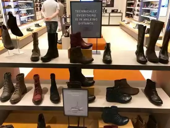
Just two simple signs give the impression that these are walking shoes built for the weather without a screaming price. The few seconds it takes you to read the signs creatively stop you.
Creativity uses imagination to solve a problem or communicate ideas
Clayton Christensen, in his book The "Innovators DNA," notes five key behaviors that optimize your brain for discovery:
Associating: drawing connections between questions, problems, or ideas from unrelated fields
Questioning: posing queries that challenge common wisdom
Observing: scrutinizing the behavior of customers, suppliers, and competitors to identify new ways of doing things
Networking: meeting people with different ideas and perspectives
Experimenting: constructing interactive experiences and provoking unorthodox responses to see what insights emerge.
I witnessed two young women who spent the better part of an hour using an app to place pig ear stickers on photos they had taken on their smartphones. Giggling, they were talking about how creative their Instagram filter was.
That’s not creativity. But where will younger employees learn to nurture their creativity in a world of pig noses in pictures?
If you make it your store, you will let them discover their imagination, keeping them involved in your business. They’ll feel more confident, and turnover will be lower.
I love this Sight For Sore Eyes store in Los Gatos. If I remember correctly, the owner’s son, a physics major, created this creative window below.
All the elements are there: well-lit curated products, props of appropriate size, a limited color palette, and creative signage that feels like something from Highlights.

When we don’t listen to that small creative voice, "What if we?" it dies, fades, and vanishes. And you end up with displays like this …

Creativity is a practice; you can look for creative answers once you know the problem and constraints.
Outside of sales training, nowhere is the creative spirit more needed than how you display merchandise in a retail store.
Creative displays will sell your merchandise like nothing else
I’m not talking about someone who can spend hours filling up a window with merchandise, leading to a cluttered and confusing space. The kind of creativity I'm talking about here is not in the eye of the beholder...
Let me be very clear...
The goal of an in-store display is to always sell the merchandise. The goal of a window display is to prompt the person walking by to walk into your store.
That’s why a great display focuses the shoppers’ attention and gets them to consider buying something.
Take a look at how this retailer made small items pop.
 Creativity led them to make or buy these small shelves to showcase on a display wall; otherwise, the items would have been lost on a table or case.
Unfortunately, below is the type of signage and visual merchandising we see too often to address the challenge of moving product: summer bug spray next to the winter salt in January.
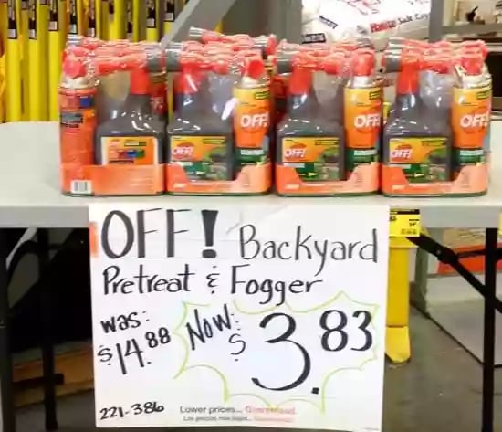
You can’t just wing it.
See also, [Pics] Steal These 9 Visual Merchandising and Store Ideas
Sales and merchandising go hand in hand for brick-and-mortar stores
There are several technological advancements in retail right now that let machines do some of the tasks humans used to perform. And the trend is only going to continue.
However, creativity and imagination are still in the domain of humanity.
Use your imagination and nurture your employees to solve the problem of customers stopping and considering your products with better displays at your brick-and-mortar store.
Don't forget to angle your fixtures so customers see more merchandise, not just end caps.
For more on merchandising, snag a copy of my book.


