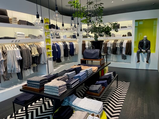
Visual Merchandising: 12 Insights How To Merchandise Your Store

Subscribe to our newsletter
Retail merchandising is such an important topic! Most of the time, smart retailers call it visual merchandising and are always looking for best practices to arrange their products.
What is visual merchandising?
Visual merchandising is presenting, arranging, and displaying products in a way that makes them grab the shopper's eye and encourages them to pick up, try on, and ultimately buy the merchandise.
When learning how to merchandise your store display to draw shopper interest and sell more merchandise it is important to consider what story you want to present.
It's easy to pile an endcap with merchandise and slap on a bright red SALE sign, but how do you move full-priced merchandise?
Many articles about how to merchandise your store leave out the important part. It isn't enough to create a "pretty display"—it has to convert lookers to buyers, or it is a waste of time.
And don't think just dragging out a bunch of sale racks onto the curb or piling your leftovers no one wanted in the first place into the front of your store will draw people in, either.
Why? Because then the front of your store will resemble a yard sale more than a going retail space.
But that requires knowing the dos and don'ts of inventory management. Does that seem intimidating? It doesn't have to be.
You need to know how to organize merchandise effectively.
My secret?
Keep it simple with these tips and best practices.
12 insights on how to use visual merchandising in your store
1. Change displays monthly
Holidays and seasons only last so long, and promotional items have a short shelf life. Feature new arrivals in your store layout first.
If you ordered products meant to go together, keep them together. You don’t want their first appearance to be diluted or the potential add-on sale to be lost.
Later, group any leftover items with new arrivals to change their look.
2. Visually merchandise the products people want, not need.
Don’t choose to highlight products the customer already needs; that is what they are coming in for. Customers respond to product displays of items they want.
For example, don’t display the cheap hand mixer when every Emeril wannabe desires the fancy KitchenAid.
Just because they need a mixer doesn’t mean they won’t treat themselves to the expensive model if it is displayed well.
3. Look for one thing that makes a grouping other than price.
While all of one product works well in a grocery store, it is little more than warehousing the items in a retail store.
Your visual merchandising strategy should include making displays according to product use – an assortment of items related to brewing and drinking tea, for example. Or display by colors – the strongest color combinations to attract attention in retail are red, white, and black.
Try related or contrasting colors. Our eyes quickly get the point and move on, so never make a monochromatic display.
4. Focus on the front of your store
Start with the display area closest to the front door and highlight your newest and most expensive items.
Be sure to have several levels of height—even on shelves. Make sure your store fixtures are clean from top to bottom and filled with enough products so that customers can pick up and touch them without having to totally dismantle your display.
5. Add a stuffed pig to at least one window. Really.
Find an unrelated item and put it on your display. It serves as a prop, and its only purpose is to grab your customer’s attention. Add a stuffed toy pig to complete your KitchenAid display.
Adding a prop to every product display is unnecessary, but the idea should always be there.
These visual elements make the customer ask themselves, "Why is that there?" They are intrigued by your visual merchandising picture and come in to learn more.
6. Add additional lighting so the merchandise stands out
Light your display like it’s important. Adjust overhead lighting. If you have a particularly dark display with no way to highlight it from above, consider moving your best-selling products to an existing light source or light from below with small spotlights. Remember, light makes the merchandise pop.
7. Add compelling signage
Add a few well-placed, well-worded signs - even on store fixtures. Ensure the signs are short and easy to read to catch customers' attention.
If your customers are mostly seniors, use larger fonts to make it easy on them. Handwritten signs with markers are okay for a kid’s lemonade stand, but they tend to look amateurish anywhere else.
Don’t ever put up signage that says DO NOT TOUCH. You might as well put up a sign that says DO NOT BUY. Displays are supposed to get messed up.
8. Rotate your displays but not your fixtures
Move existing displays around the sales floor when new merchandise comes in. Since the fairly new inventory will still sell, switch your store layout two weeks after arrival. Move one from the front to the middle of the sales floor and the other from the middle to the back.
9. Track your sales by SKU
Monitor your computer printouts and inventory levels weekly. If something takes off, be prepared to reorder these best-selling products immediately.
If you have sold through your inventory and have no back stock, change your visual merchandising plan to something you have plenty of.
If something doesn’t sell, try moving the same display to another location or incorporating different product placement before giving up on it.
10. Make sure every product in each arrangement is priced
Make sure all of your product is priced. No one wants to have to ask how much something is.
 11. Engage more than one sense in your store
You may have seen those stores selling health aides in malls with several oil diffusers working, pictured at right.
You're probably already wondering what they smell like. That's the power of engaging more than one sense.
I've seen retailers use ScentAir for beachy Tommy Bahama clothes departments to engage the nose, high-end grocery stores to offer fine food tastings to engage the mouth, and sound retailers to have separate rooms to engage the ears.
Just make sure to go easy on scent. Many people have allergies or other preferences.
12. Add motion to your display
It is easy to only think about what the display looks like in terms of colors and textures. Still, you can go further and add movement with a fan carefully placed out of sight to slightly billow out a summer dress, add a toy train during the holidays, or demonstrate your product in use. Usually, the motion also provides a sound, which is a bonus.
Or, check out a company that works with in-store media for retailers.
See also: How to craft a retail merchandising plan with this comprehensive primer
The most important element of visual merchandising
What's the most important aspect of visual merchandising? Your creativity. You must learn the science and the art of arranging beyond just SKUs and discounts.
These retail merchandising tips do not include all possible ways to organize merchandise into your silent salesperson. Still, they form a foundation any retailer or small business can use to boost sales.
Be careful that your floor plan remains open and that aisles are easy to walk down. Customer service extends to the ease with which they can navigate around your stellar displays.


