9 New Visual Merchandising Trends For Your Store
Subscribe to our newsletter
Visual merchandising covers everything from how you visually arrange your merchandise to how you interrupt traffic patterns in your store, to how you display items to promote add-on sales, to signage, and even to how you integrate all that into social media.
I’m always on the hunt for great visual merchandising that helps grow customer perception based on the experience they have in your shop.
Here are several design elements and visual merchandising tips you can use for inspiration in your retail business.
1. Social media evolution
Smart retail stores now design social media opportunities into their stores. In the past, social media was an afterthought. If stores used it at all, it wasn’t much more than a frame on a wall and a sign that said, "Please take a snap and tag us on Facebook or Instagram". Or even less, asking people to check in stuck on their windows.
Social has evolved into making user-created content an integral part of the store experience, like this display at the front of Neiman Marcus’ store at Hudson Yards.
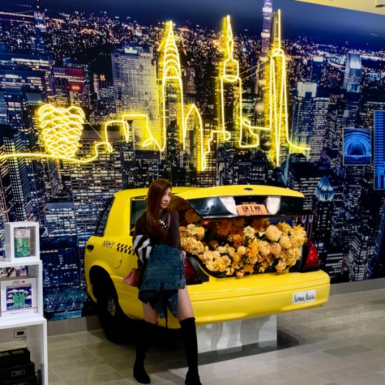
I like this social media display for a variety of reasons. It is big enough for multiple customers to take a selfie. The yellow of the iconic taxi cab is picked up in the neon that outlines iconic structures in Manhattan including the Vessel, Hudson Yards 150-foot high steel interactive artwork and major tourist draw.
The branded bumper sticker on the back of the taxi and the license plate MM X MM, affirming Neiman Marcus Loves Married Men (I think that’s what it stands for), create an understated cool; they don’t even have to ask for you to post or use a hashtag. They just know you will.
While this trend may not increase sales, it does provide the brand the social cred and brand identity younger generations crave to show off.
What can you do? If you have enough room on your sales floor, you can recreate something based on your locale with very specific references. The key is to give it enough room to make it a featured element, not a crammed-in afterthought.
2. Mannequins that make your retail outlet look busy
I visited Saks Fifth Avenue a year ago that showcased their amazing staircase that connects the ground, first, and lower levels with a diamond-shaped atrium, with the first floor visible from the ground level.
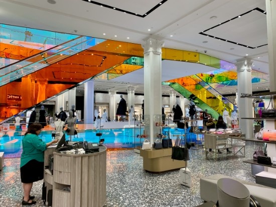
The glass panels that form the escalator railings and balustrade of the stairs are coated with a film so it changes color when viewed from different angles in the flagship. It elevates the customer experience, and that’s spectacular, but their visual merchandising crew is very creative.
Check out this one for raincoats with videos of thunderstorms. Awesome!
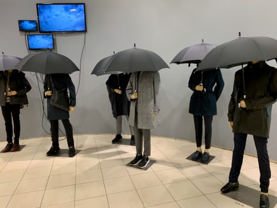
On my last visit to the store, I saw again something I’ve never seen before, mannequins in the raceway around the men’s department. At I thought, "Wow, this store is busy!" Then I realized what it was I was actually seeing.
Take a look at the movie I shared on LinkedIn below:
In addition to the in-store signage of brand names on the floor, you see multiple looks meant to draw you in. Oh, and in case you worry about strollers and ADA, anyone can move into one of the departments to shop; it does not feel crowded.
I just wish their employees were as great as their displays; sadly I received bad customer service but one guy helped make up for it.
What can you do? Consider a set of life-size mannequins fronted with floor signage of your brands. You can do this yourself or ask a FedEx Office or your local PostNet to help you.
3. Shoes on walls, not on tables
Merchandising tactics for footwear used to focus only on tabletops that interrupted the shopper on the way through a shop.
Nowadays, retailers have found that displaying small groups of shoes on a well-lit wall where customers can easily see and touch them draws shoppers to the shoes, more than any tabletop. It also provides a cleaner shopping experience because the floor is less cluttered.
Check out this display at Vans in the Meatpacking District across from the fabulous Samsung 837 flagship store.
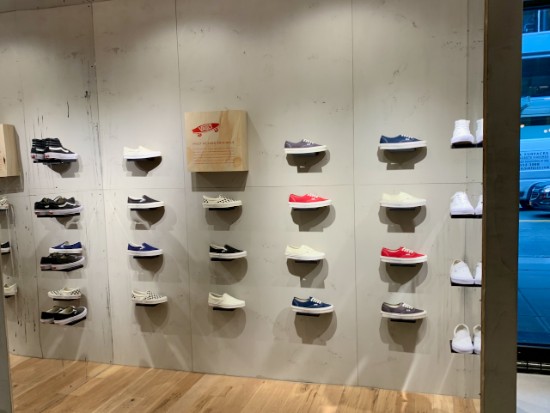
What can you do? Move away from jamming all your products on slat walls. Group products together by family or use. Make sure they are no more than 6’ above the floor.
4. Customization is everywhere
Not only are footwear retail stores leading the way in streamlined merchandising, they’re also offering ways to customize a purchase. Personalization is key to driving purchase, and nowhere is this more evident than in footwear.
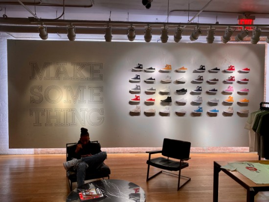
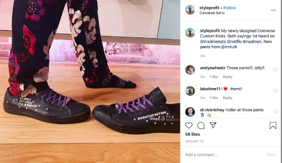
Take a look at Converse in SoHo where my buddy Tony Drockton displays his customized Converse kicks, each with two of his favorite sayings from Mad Men, "Dissatisfaction is the shape of ambition" and "Stable in between success and failure".
Throughout my New York visit to multiple retailers, it became clear that any shopper can personalize almost anything any retailer sells and that it is a simple thing to do.
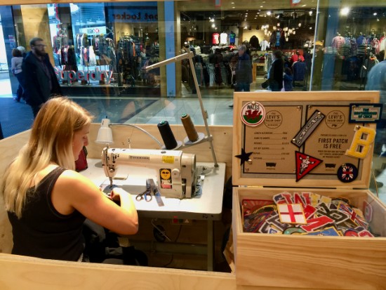
What can you do? If there is any way you can add custom embroidery, logos, or sayings to a product, do it. You can use this Xerox printer, an embroidery machine with simple pre-programmed sayings and emojis, or even a custom tailor.
Just make sure you keep it front and center like this Levi’s store in the UK.
5. Loft selling
I’m not sure if it is the popup-shop effect, but new retailing means everything is on wheels, and no walls. Temporary is in.
& Other Stories, H&M’s new higher-end brand, features a color-coordinated collection of wardrobe staples as the shop’s main attraction. But look closely and you'll discover Shoppers can also pick up chic beauty items and accessories from fixtures all designed to be moved, taken down, and reconfigured.
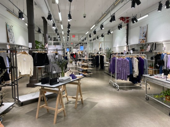
This makes moving the merchandise around an easy, one-person job. It also visually makes for a lighter look reinforced by the white walls to keep focus squarely on the merchandise.
What can you do? Design comes from function. If you want to take elements from this, consider a laminate, hardwood, or polished concrete floor for ease of movement and avoid carpeting of any sort. Ditch a few of your oldest racks and go shopping for those similar to the ones below seen at Dick's.
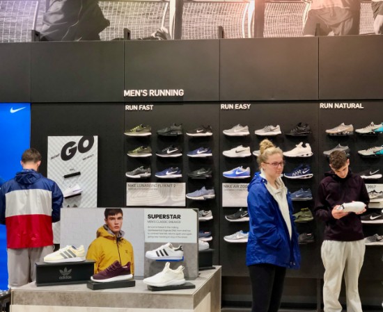
6. The death of the four-way
The four-way merchandising fixture was a staple of retail that began in the 80’s. The trouble with them however was you couldn’t really show a lot of product, and the shopper had to circle around the unit to see all that was offered.
In 2020, modular store fixtures are still built to show a whole look but in a narrow space that doesn’t require much more than a scan from the shopper.
Check out this fixture at Nordstrom’s’ Women and how it can hold a whole line of heavy jeans, coats, and tops. Also notice the wheels and additional shelf underneath that can be merchandised and also keeps it from looking cheap.
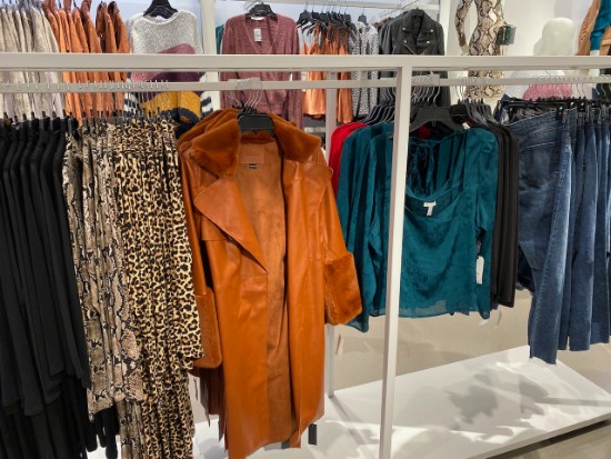
What can you do? If you’re looking to stand out in your shop and have space, take a look at something other than slat walls, rounders, and four-ways. While the fixtures shown above are custom, look here for an index of Nordstrom fixtures.
7. Unwrapping shop displays
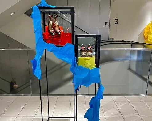
Anthropologie has used stiff, colored paper in their windows and retail environments off and on for a while. Nordstrom recently featured it in-store on existing display units to focus attention on one or two items.
That display technique seems fresh; the color draws the eye to the product in a way a glass case simply can't.
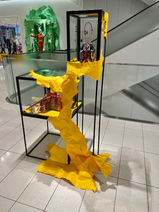
What can you do? Craft a display and then fit colored Kraft paper around the fixture to cover about a third. If you want to be really ambitious, use one color for a wall display as you see in the background.
8. Perfect sightlines
It is always good to create space for your items, especially for items that are at the top-end of your price points. Perfect sightlines are being implemented across apparel and other departments to make each different item stand out as in this handbag display.
Notice below how the tables and squares used to add elevation disappear under the merchandise which gives the effect that the items are floating in the space.
Sightlines, when implemented flawlessly as seen at Nordstrom Women’s, make every item seem special which results in fewer markdowns and a greater feeling of scarcity.
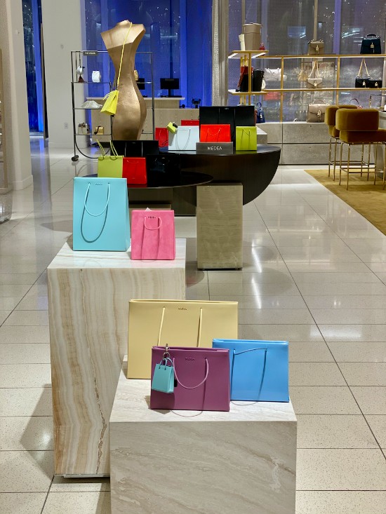
What can you do? Create one display down the middle of your store as if it were an exhibition design. Use a measuring tape so the tops of the products gradually rise. Note also, this works for one brand, not several, and your lighting has to be even across the whole display to make the merchandise stand out.
9. Social responsibility
Refinery29 reports it takes 2,720 liters of water to make just one t-shirt. In 2015 alone, the fashion industry consumed 79 billion cubic meters of water, enough to fill 32 million Olympic-size swimming pools.
That figure is expected to increase by 50% by 2030. Retailers of all kinds know sustainability is not a trend and shoppers are looking to see how environmentally and socially conscious you are.
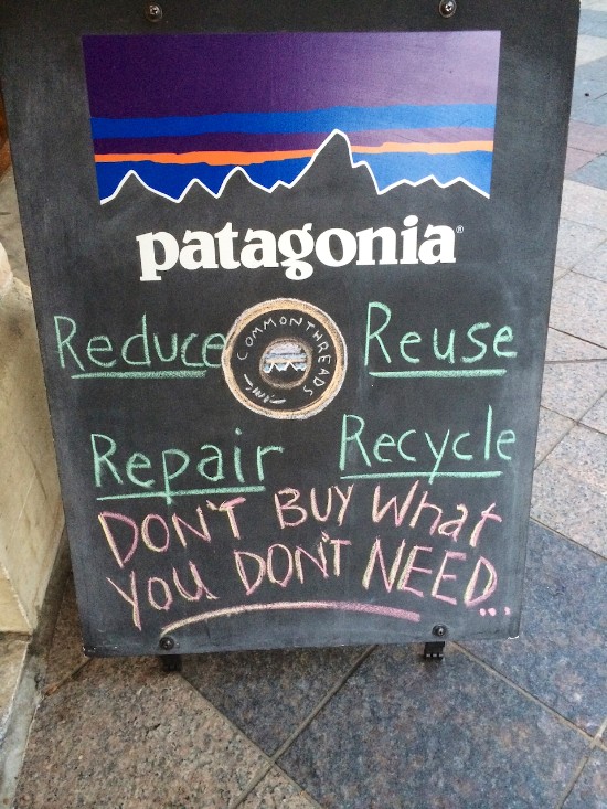
Some brands like Patagonia implicitly tell you not to buy what you don’t need.
Nordstrom New York makes a big display right by their BOPIS counter to drop off gently-used clothing that they will send on to a charity.
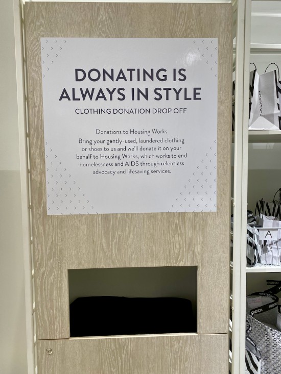
What can you do? Reducing fashion industry-related pollution has long been embedded in many brands. If you decide to adopt this trend, make sure the bin is covered and doesn’t look like junk. Make sure your sign shows exactly what charity the clothes will go to, and have a lock so curiosity seekers are curtailed.
See also, Visual Merchandising: How To Create Retail Counter Displays That Work
Creative shop displays will help you sell!
While online retailers may be able to attract shoppers to their sites, the reality is most suffer from 90% cart abandonment. Only 2.86% of eCommerce website visits convert to a purchase.
Brick and mortar retailers have the upper hand because visitors to their stores can take action by seeing, feeling, and touching their merchandise. People who interact with merchandise are more likely to buy than those who can’t.
For more retail visual merchandising ideas, check out my Pinterest board.
Use these visual merchandising tips to attract more shoppers and to convert more lookers into buyers.
Take my free 5-part email course to learn how your retail store can outsell any online retailer. You can get started with your first lesson by entering your name and email address below ...

![[Pics] Steal These 9 Visual Merchandising Tips and Ideas](https://www.retaildoc.com/hs-fs/hubfs/IMG_3738.webp?width=102&height=111&name=IMG_3738.webp)

