Updated Nov 14, 2023
I was at a candy store at Chicago’s O’Hare Airport last year with as many products on the counter around the register as on the shelves.
I was at the counter in an independent hardware store last month, and right in front of me was a power tool on sale for just under $50…
I was at a wine shop last week, and they had three different Syrahs at $30+ a pop on the counter with a sign that read Try something new...
Geez, I thought, how many retailers don’t understand the dynamics of a customer standing at their retail counter?
Let me explain...
Once a customer has ticked off the end of their shopping list or the poorly trained employee has said, “Anything else?” the customer is outta there.
A customer at the register is not there to browse, not there to have to make a choice, and not there to do anything other than pay for their merchandise and get on with their lives.
As part of your overall visual merchandising strategy, a great counter display can interrupt them and get them to buy…
But only if you follow the rules.
What are the rules for a great retail counter display? Glad you’re asking…

-
One product. You want to focus their consideration on one item. The lack of choice makes it a straightforward yes/no decision.
-
The featured product should be something everyone can use, old or young, etc. The universality of it makes it easy for customers to throw it on their tab. Note: gift cards are not a product.
-
Keep the price point under $20; under $10 is even better. Most customers can drop a ten-dollar bill without noticing.
-
Get full margins and then some. If the items can be easily pocketed when a cashier is swamped, you need margins to cover those thefts.
-
Keep the counter displays fresh and change them weekly. Timing is everything. A twine display at a home store on the first lovely spring weekend would be excellent as gardeners are cleaning up - and who can’t use string?
-
Keep the signage short and to the point. Grabbing a customer's interest should take no more than seven words. Like all signs, your goal is to paint a picture. Almonds make a great afternoon snack! will tempt someone to purchase them much more than a sign that just reads 2 for $5.
See also, How To Visual Merchandise And Create Killer Retail Windows
What are the don’ts?
-
It’s not a clearance aisle. If you are trying to move slow sellers, the counter is not the place. There’s a reason they didn’t sell in the first place.
-
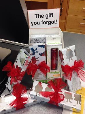
Don't have the right sign in the wrong place. At an auto parts store, I was in line at the register when I noticed a sign asking, “Need new windshield wipers?” I considered them and looked at the 50 choices behind me, but I didn’t want to start shopping again. I was frustrated. You don’t want customers frustrated at checkout. Make sure your signs at the register keep customers moving out the door. The gift you forgot (above) was perfect for the week before Christmas that Cacilda Hannigan used.
-
Don’t expect your cashiers to help you. The display has to do the heavy lifting. You could script something for the cashiers to say, “Did you see we have batteries 2 for $5?” but your cashiers won’t do it. Instead, create the right sign, “Make certain your flashlight works,” with the most common-size battery below it.
-
Don’t wall off your cashiers with lots of impulse items. Such a barrier will make them feel inhuman. With too many choices, you will make those cashiers have to answer product questions, which will slow down the line.
But the main thing to remember in any visual merchandising is not to make your customers have to think because, again, that slows down your line.
Checkout is a game of seconds. We’ve already decided to leave the store. And while talking about the counter, don’t make customers wait for someone to register for your loyalty card...I’m talking to you, Walgreens…
The Point
Now, do the math. Your ROI will be huge if just 10% of your customers add a $10 item to their ticket.
If you're planning on doing away with registers and having your POS on iPads, notice you'll probably be unable to get those additional impulse items.
You've done the hard work of converting a browser to a customer; now maximize their trust with a compelling counter display. It will take some work, but the rewards are higher profits and higher KPIs.

