Retail Merchandising
What is retail merchandising?
Retail merchandising is the organization of merchandise in an appealing way to get shoppers who come to a brick-and-mortar retail store to be engaged and inspired to purchase more product than they initially thought they would.
A lot of retailers would be hard-pressed to answer the question, "What is retail merchandising?" Retail merchandising covers everything from how you visually arrange your merchandise to the traffic patterns in your store, how you display items to promote add-on sales, signage, and for apparel retailers - the power of the fitting room.
Visual merchandisers also analyze the behind-the-scenes data that proves what is effective and what isn't. This post serves as a tactical primer for retailers looking for visual merchandising strategies and product merchandising ideas.

SUBSCRIBE TO RETAILRX
The Retail Newsletter over 100,000 Retail Pros read
Insights and tipsRetail Industry News
Out Weekly
Get it in your inbox.
By entering your email you expressly consent to receive other resources to help you improve your marketing efforts.
|
|
"As they’ve seen viewership fall off, we haven’t seen [a competing company] try to reinvent it. The ticket is going to be solving what’s going wrong in the stores first. Then you can do anything, because you know who your market is and how you’re going to reach her." |
|
|
"This whole idea that there is this retail apocalypse that is inevitable and that the malls are dead? Clearly that's wrong because that's where Macy's is," said Bob Phibbs, CEO of the Retail Doctor, a consulting firm, in an interview after the results came out." |
|
|
"Lord & Taylor was always a cut above Penney and a direct competitor to Macy's. But the middle is getting squeezed, unless you're willing to spend money on your stores like they did with Saks. Clearly they get it — that ability to wow shoppers — that’s the market." |
When done right, retail merchandising removes the confusion of what to buy from shoppers, encourages a customer to shop in your store rather than in another, and, most importantly, converts more shoppers into customers.
It's a coordinated effort that keeps you from carrying a ton of SKUs, slapping them on a wall or table, and expecting them to sell. Too many choices make shoppers feel overwhelmed.
Why should merchandising matter to retail management? The quicker you can cut down on a shopper's choices, the quicker you can make them relax and consider purchasing your merchandise. The less time you devote to arranging your store and displaying your products, the more overwhelmed your shoppers will feel when trying to know what to look at. And an overwhelmed shopper never becomes a customer - they just leave.
You can attract as many new bodies to your shop as you want. Still, if they discover a hodgepodge of merchandise that takes too much to figure out, if they meet with too much frustration trying to find what they were looking for, or if they encounter only flat or uninteresting displays, your merchandise will sit. Merchandise that sits too long is like spoiled milk; it starts to smell and loses all value until it is thrown out.
Your shoppers shouldn't notice great in-store merchandising, but they should focus their eyes on a display. The lighting should draw them toward a fixture; the signage should pique their curiosity and make them want to buy more.
To implement a strong retail merchandising plan, you have to have someone who understands the science of which colors are in fashion, what trends they can tie into, the cause and effect of fast-moving or dead products, as well as someone who has the creativity to create the excitement of serendipity when shopping in your brick and mortar store.
At its most basic, an in-store merchandising plan should include the following:
-
An overall store layout plan of how traffic will move through your store.
-
A department plan that changes in-store displays with the seasons and holidays.
-
A budget for store fixtures, props, lighting, and signage.
-
A merchandise planning system that will help maximize turn, limit out-of-stocks, increase margins, and minimize markdowns.
-
An open-to-buy system and predictive analytics to determine the variety of merchandise available to shoppers.
The time needed to merchandise a store will vary due to various circumstances, including the total number of SKUs, the size of your window displays, special requirements for individual displays, especially those needing security, and your ability to move your fixtures easily. Large stores have entire teams devoted to the four separate retail merchandising areas. At the same time, single-operator locations struggle to do something more than just get the merchandise out and priced.
Remember that there is no merchandise in your store that a customer can't purchase online.
Therefore, when they drive to your store, they expect to get more than they can glean from a website. That’s where the art and science of retail merchandising give brick-and-mortar retailers an advantage over their online competitors.
To begin merchandising your store, always start with the front doors, for this is the first chance your customer has to understand the alien planet that is your store.
-
Newcomers hate to have to ask where something is. Is your directional signage easy to understand and well-placed so shoppers can navigate your store layout?
-
People like to shop in bright, energetic spaces. Is there adequate lighting to achieve this?
-
With shoppers wanting to proceed counter-clockwise through a store, is the counter location causing friction between those browsing and those queuing up to pay?
-
There should be visual barriers between departments to make a large store seem more intimate. Are those backdrops or barriers interesting enough to draw shoppers to them?
-
Displays are your silent salespeople because they can show an entire system or series of add-ons to lift the average ticket. Are the relationships in your displays obvious?
-
Well-placed, well-worded signs help intrigue, answer questions, and entice shoppers to look, touch or hold. Do yours?
-
An apparel store's best chance at converting lookers to buyers is with bright, air-conditioned, and clean fitting rooms. Are your fitting rooms up to the challenge?
You’re always working on three things with your plan: the current promotion or event, the one upcoming, and a review of the one just passed. That’s why it’s always best to set up a full-year calendar as part of your retail merchandising plan noting holidays, seasons, local events, and promotions.
If you’re looking to master the retail merchandising program, there are several degree programs where you can go to deepen your knowledge, critical thinking, and skills. We also have a whole course on in-store merchandising in my online retail sales training program SalesRX.com.

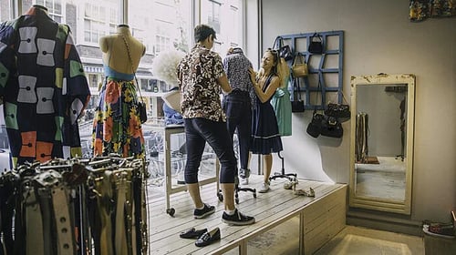


Visual merchandising is everything a shopper sees at your store, hopefully leading to a remarkable shopping experience. It is the unspoken language retailers use to communicate with their customers. The advent of omnichannel retailing also connects to the online brand experience, providing a seamless, consistent look and feel between the web and the physical store.
It's easy to confuse the broader retail merchandising plan with visual merchandising. But visual merchandising is only a part of the retail merchandising plan that also includes rearranging merchandise, shelving, and fixtures to maximize sales and maintain the cleanliness and functionality of the store fixtures, signage, and lights.
So is visual merchandising the same as displays? No, visual merchandising is more of a high-level view that includes eye-catching visual displays but continues to lead the customer through the entire store. Specific product displays focus on just one department or brand.
One thing many retailers miss is that visual merchandising is a team effort; you must train all store associates about visual display standards and maintenance. Otherwise, they'll simply say, It's not my job, or refuse to sell a shirt off a mannequin.
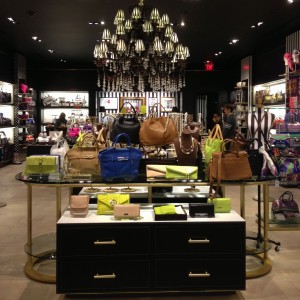


A visual merchandiser is responsible for creating an environment that sells, one that allows shoppers to relax and consider all your store has to offer by crafting areas of discovery. The best visual merchandisers creatively design displays, create planograms for window displays, create display and directional signage, buy fixtures, and generally decide what goes where, why, and for how long.
Ultimately, they must be both business savvy and creative in constructing an environment that stimulates consumer behavior enough to increase their desire to buy what they came in for, as well as the add-ons they didn't know they needed...and all at full price.
Here are seven tips and tricks for visual merchandising your brick-and-mortar store:
-
Great in-store merchandising invites shoppers to take a look, so avoid putting a display table perpendicular just inside your entrance.
-
Moving a product from its regular shelf location to a featured end cap has been proven to lead to an average sales increase of 25%, so regularly move your products around.
-
Digital displays can help tell a fuller, specific product story but can also detract customers from the products they are near, so make sure your digital displays are supporting but not the main show. If conversion doesn't improve, change messaging or location.
-
Look through your whole sales floor for distractions. Are there too many messages to try, do, buy, or look at here? Streamline a shopper's experience so they linger, not bolt for the door.
-
Select fixtures with wheels, allowing you to change your entire store quickly and efficiently.
-
Feature your best merchandise at the front of the store as shopper interest wanes the further they go into the middle of a store.
-
Put sale items in the back so thrifty consumers must move through your sales floor to get to them.
To go deeper with your group on visual merchandising, have Bob present his popular speech How To Visual Merchandise Your Store With Displays That Sell
Great in-store displays take the customer from either not noticing or feeling stupid about a product. It gives them the bright idea about how it would look in their homes, how they could use it in their business, how they would feel wearing it, and especially how they could smartly combine several items.
Displays help build sales because they stop the customer in their tracks and persuades them to select an item they hadn’t necessarily considered. Properly built merchandising displays throughout your store layout gives them hope that what they purchase will deliver more than just a price.

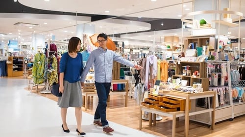

Sloppy or poorly coordinated displays rob your store of its ability to make additional profit. I saw an end cap at a grocery store that had Oreos, toilet paper, and bleach. You never want a shopper to scratch their head, trying to figure out why your items are displayed the way they are.
For that reason, you want to know the different types of displays to choose from:
Five Types of In-Store Displays
-
Complementary displays that say, This makes this better.
-
Coordinated displays that say, These are all the items you need for this to work.
-
Creatively constructed displays of one product. Think 6-packs of lemonade stacked as a school bus.
-
Product in-use displays that show the product in its environment. Think a mixer, spatulas, or cookie cutters on a countertop or lawn mower, edger, and fertilizer on grass sod.
-
Surprise prop displays where you add an unrelated item to your product. Think of a pink stuffed toy pig sitting on the chair next to the BBQ. Welcome customers like they’re coming to your home.
Is there a difference between what you should do when setting up your display windows, display cases, shelf, or table displays? Not really. The key is creating a story using different items that work together.
Here's how merchandisers create effective and interesting retail displays:
1. Begin by asking yourself these questions:
- Is the retail merchandise you select for your display high profit?
- Will it deliver more profit if you pull it off the shelf and feature it?
- Is it a limited-time item that can only sell for a short period? Are the products you select solutions for a common problem?
- Is it a want, an item that a customer might covet in their heart of hearts but probably doesn't have on their shopping list?
- Is it something that can be bundled?
2. Put new arrivals first
3. Use a color story of contrasting colors
4. Vary heights and add at least one prop to add interest
5. Light your display like it's showtime
6. Add well-placed signs
7. Keep it simple. Don't group more than five different products.
While window displays in Manhattan, London, and Chicago are legendary due to their scale and resources, anyone can do window displays with very little expenditure of money as long as you follow the seven-step approach outlined above. It also helps to think of your displays in terms of social media; a good one should be Instagrammable.
With labor scheduling budget cuts, remember your displays are your silent salespeople. A well-crafted display grabs a shopper’s interest and shows rather than tells.
You might be tempted to involve your whole staff in visual merchandising and displays. Avoid this hands-on experience temptation unless you're willing to teach them everything about your retail merchandising and display plans. Otherwise, they'll get the idea to create a display when the store is slow, and the result won't be as well thought-out as you'd like.
There can be exceptions of course, so if you find some interested and creative visual merchandisers, give them some training about how you are trying to focus the customer’s eyes, why you choose the colors you do, and the different heights you can use to achieve a longer linger time from the casual browser.
Three things you can teach your retail associates about displays:
-
When something is sold off a display, put another item on it. You never want naked mannequins or empty tables.
-
If items come from another department, write down where they came from so other employees know where to find them, so they won’t tell a shopper I don’t know.
-
Take a picture of each display so everyone in the department knows what it should look like and can keep it that way.
A retail store has three types of signage: directional, informative, and invitational. The first is used to identify what is found in various departments. The second is just like it sounds: signs like customer service, returns, BOPIS, and even layaway or custom order signs. The third is used to entice a shopper to come closer, to point out benefits over features of a display of products, and even to make a shopper laugh.
.png?width=600&height=155&name=IMG_1776%20(1).png)
.png?width=450&height=116&name=IMG_1776%20(1).png)
.png?width=350&height=90&name=IMG_1776%20(1).png)
.png?width=300&height=77&name=IMG_1776%20(1).png)
When you are thinking about how to create store directional or informative signage for your brick and mortar store, begin by thinking like a new shopper to your store.
- What would they be most interested in knowing?
- What if they wanted to go to the bathroom?
- What would they need to know to get to the department they are interested in?
Then write down the ten most common questions you receive in a day. I’ll bet many are either looking for directions or store information.
Next ask your staff what are the most common questions they receive every day that are not product-specific.
Now you can prioritize all those concerns and make signs that address the most important ones first.
Invitational signs are rare in many retailers’ stores because they take a bit more work than slapping a sale price on day-glo yellow posterboard, but they can deliver many more profitable sales. You find these outside on sidewalk A-frames, and in both window displays and in-store product displays.
All three types of signs share the same design characteristics and here’s how to create them.
The nine best practices for creating signage:
-
Find a color palette and stick with it.
-
Use a big enough font so no one has to squint to read it.
-
Keep the word count short.
-
Ensure the sign applies only to what it is in front of, on top of, or next to.
-
Limit your use of the word No. For example, instead of No Refunds after 14 days, say Refunds available within 14 days.
-
Explain benefits over features. For example, say Thickens Balding Hair instead of 39 Herbs and Minerals.
-
Use humor. For example, in a floral shop, ask How Mad Is She?
-
Use analogies. For example, declare, Like A Shot of Espresso For Your Skin!
-
Test signage for clarity by using your desktop printer before committing to having them professionally printed.
The five best practices to avoid for your signage:
-
Don’t allow hand-drawn signs.
-
Don’t use the words Do Not.
-
Don’t be English-centric if you’re in an area with a high population that speaks another language. Add translations.
-
Don’t use ten identical signs when one will do the job.
-
Don’t just have a sale price; show the original and the percentage discount.
I’m sure some of you will be surprised that fitting rooms are considered part of retail merchandising, but when it comes to clothing, the sale is only made once someone tries it on. The fitting room is a huge advantage for brick-and-mortar retailers. An Accenture study revealed 70% of online apparel is returned due to fit issues. However, when the apparel is tried on in-store, that drops to the single digits.


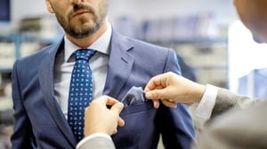
The proof of your retail merchandising comes together in the fitting room which moves your shopper from browser to customer. You are taking the vision you created in your store that stimulated their buying sense and fulfilling it in your 5’x8’ fitting room.
Just like a well-designed display, the fitting room experience has to continue the engagement from the salesfloor, so here are three tips to make that happen:
- Keep the fitting room floors spotless - pin, hanger, and clothing free.
- Provide lighting that helps the selling process by making the customer look good. Backlit mirrors are the best.
- Install good quality mirrors inside the dressing room so the shopper looks realistic.
And always remember…
- If a shopper has to wait long, they’ll walk away.
- If the room has bad lighting, conversions will suffer.
- If the room doesn’t have air conditioning, it will be either too hot or too cold – never good for half-naked people to feel uncomfortable.
- If you abandon them, they’ll get frustrated and leave.
You’ll have to work with your Director of Operations and store managers to ensure all associates are properly trained to monitor and service the fitting room visitors to increase conversion rates.
Retail Merchandising refers to all the activities, both seen and unseen, which contribute to selling products in-store. It includes the visual merchandising which creates the environment to sell, the displays which stop shoppers in their tracks, the signage that directs, informs, or inspires them, and the fitting rooms where the final decisions are often made.


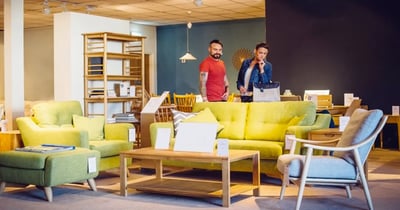

Use these tips, tricks, and best practices for merchandising your store like a pro and enhancing the customer experience. And if you’d like me to speak to your group about how to make displays that convert along with signage that entices, visit my speaking page.
- 1. Introduction: What is Retail Merchandising?
- 2. What Makes Retail Merchandising So Important To Your Brand?
- 3. Visual Merchandising: Curating Your Brand Experience
- 4. Great Displays: Stop Your Customers In Their Tracks
- 5. In-Store Signage: Direct, Inform and Inspire
- 6. Fitting Rooms: Create A Welcoming Experience
- 7. Conclusion: Retail Merchandising: Pulling It All Together
Read More About Retail Merchandising
Related Blog Posts:
- How Your Merchandising Can Influence Customers To Increase Retail Sales
- Visual Merchandising: 10 Insights How To Merchandise Your Store
- [Pics] Steal These 9 Visual Merchandising and Store Ideas
- 7 Tips To Create Compelling Signage For Your Retail Store
- How To Visual Merchandise And Create Killer Retail Windows
- Retail Signage: Examples of How Not To Talk To Your Customers [Pics]
- How To Get Retail Shoppers To Make Unexpected Purchases In Your Store
- 7 Ways To Transform Retail Store Displays Into Sales
- How Stores Can Use Their Fitting Rooms To Fight Online Retailers
- Learn About Bob's Speech Visual Merchandising for Sales


