Retailers, It's time to take a closer look at your visual merchandising and ensure it creates an inviting and intuitive atmosphere for customers. Are you blocking the customer’s path to purchase?
Many times, in our efforts to create aesthetically pleasing displays and clever promotions, we can accidentally become roadblocks between shoppers and their purchases. Let's shed some light on how we can ensure that these eye-catching visuals of our products make it easier for customers to get what they need from us - not just look pretty.
Let's work smarter instead of harder when it comes to meeting your customer needs through visual merchandising! But first, a bit of a rant...
Is there some visual merchandising book titled How To Make Your 6000 Square Foot Store Look Like It is Only 60?
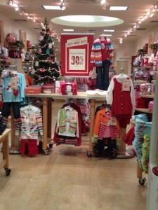
I’m talking about this obnoxious habit of retailers putting a long table across the front of the store entrance.
What makes it worse is it is within about eight feet of the front door.
Take a look at this retailer's store entrance ...

And this ...

These retailers' visual merchandising managers have put whatever they think is their “best” on this table to grab passersby's attention. Usually, it’s the sale stuff like this…

These stores have effectively cut off the rest of their stores from the views of their customers.
Do they realize these tables, usually packed with clothes, create barriers to their customers' entry?
If they had bothered to spend thirty minutes watching their shoppers, they would have seen them glance at the table, then turn around and leave. They would have seen only a few customers actually walk around the table and into their store.
Nordstrom understands this. Take a look at this.

Their red carpet helps to draw the shoppers’ eyes and bodies into the store.
Saks also understood this when their visual merchandising included a table but angled customers right into the store.

Here's a smaller retailer that, while they have a table, places it lengthways so it mirrors the flooring to draw shoppers' eyes and bodies into their store again.

Williams Sonoma understands shopper behavior, too. Their entry is sided by smaller tables highlighting special items or themes to encourage browsing.

That’s what you want to do, those in charge of visual merchandising, draw customers in, not keep them at arm’s distance. If you're going to grow retail sales, don’t put up barriers to purchase – and don’t put up tables that block.
When visual merchandising the front of your store, remember: less is more.
Want more tips on how to be a better retailer? Sign up for my weekly newsletter below.

