When you are coming up with signage for your retail store, you must be careful you don't upset customers unknowingly. As a retail speaker, I'm asked to help demystify merchandising and retail signage so audience members can create kick-butt displays that sell. I reveal the nine types of displays, what makes them different, and how to use them.
What is it about signs? They should be short, informational, welcoming, and clear, especially in smaller retailers, regional chains, and Main Street boutiques.
Instead, we find ones that are confusing or meant to stop or inhibit customers, creating negative energy in the store.
And more importantly, thwarts your efforts to build retail sales.
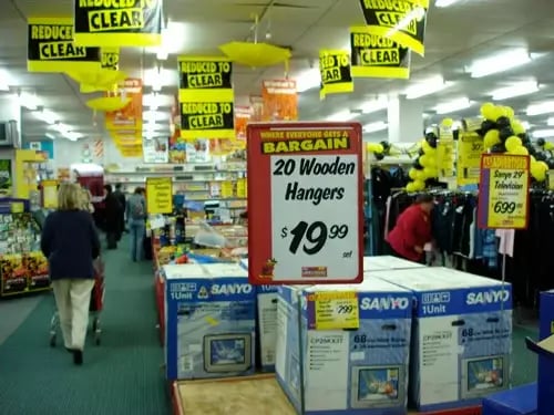
A wrong item with a sign. (Hanger sale sign with a pallet of air conditioners.)
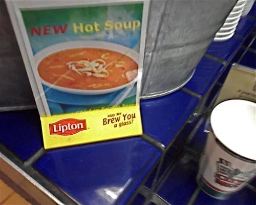
Reusing old branded Lucite holders. (Anyone for fresh-brewed soup…)
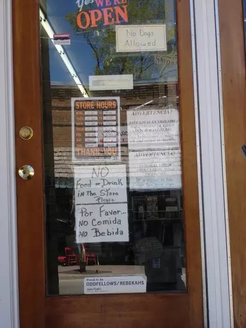
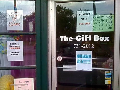
Doors often tell us it is NOT a good place to shop.
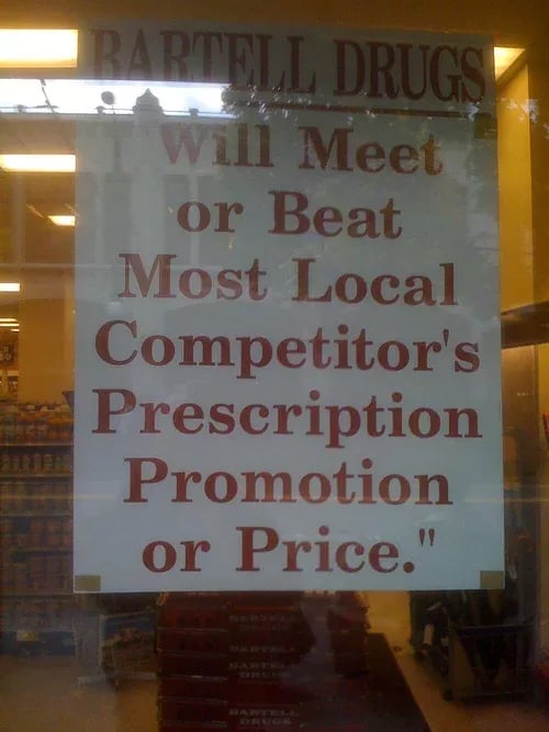
Wishy-washy guarantees
An annoyed manager adds plenty at the register
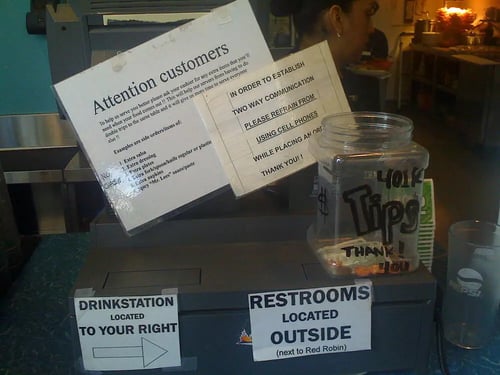
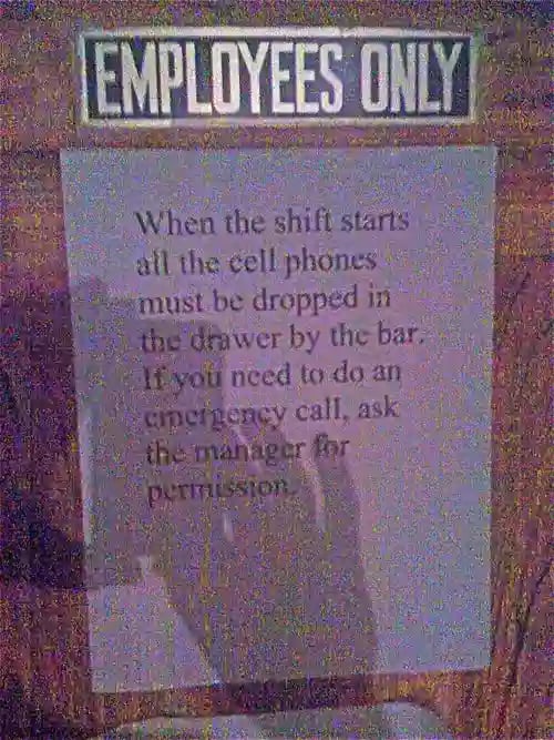
Signs for employees posted in public
Signs on top of signs
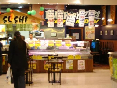
Plastering the exterior with signs
People you hope will read this won’t. Those who do will be annoyed.
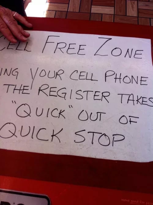
Scolding customers not to touch doesn’t make them want to buy
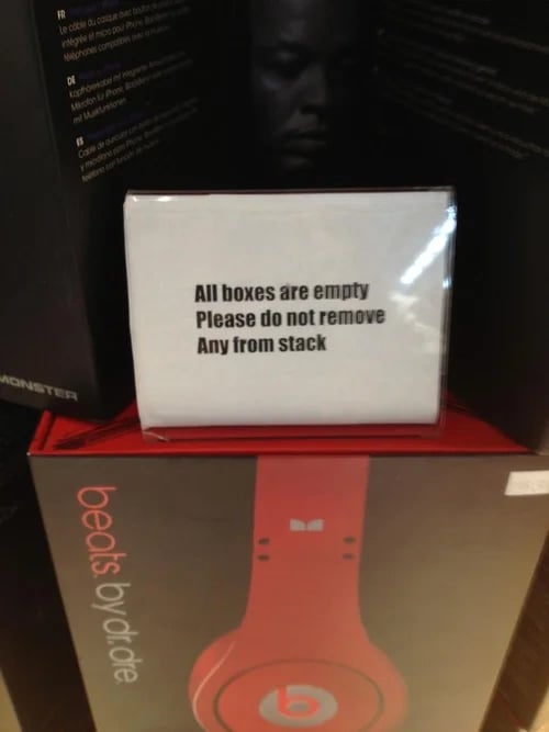
Again, scolding parent signs are rarely read and only distance you from real customers
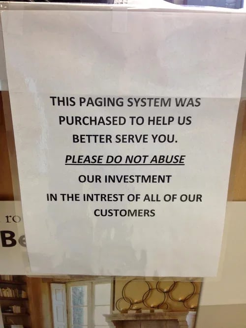
Confusing signage to all but whoever came up with this.
Choose images wisely. Because, after all, do you want to feel like a snail? Yuk

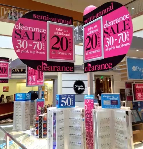
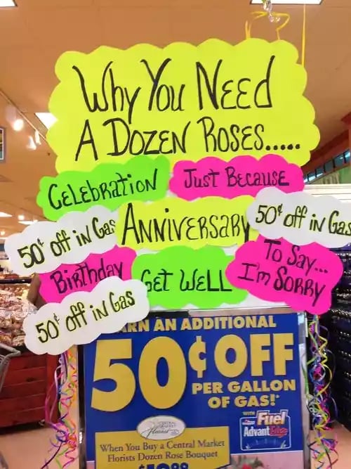
Silly offers. All that for 50 cents off? Too many colors and messages.
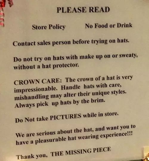
This was a 24×36″ sign posted at the front of a hat store. In other words: Don’t bother us.
Do you want to stand out?
Don't give the wrong person access to your printer.

