Updated November 7, 2024
I did business makeovers for the Los Angeles Times when I lived in LA. Now that I speak and travel more, I only do business makeovers as a paid consultant.
Recently, a spa and outdoor furniture retailer contacted me for help with a storewide refresh focusing on their Retail Merchandising. I’m sharing five tips any retailer can use to help refresh your store.
Of course, you can contact me here if you want my help.
When I approached the store, I was taken by how much Big Green charcoal was piled in the windows and throughout. There was no focal point, so upon entering, your eyes would be drawn to the cabinet lights on the mezzanine.
One of the traffic draws at the location is free water testing on the mezzanine.
How do we interrupt shoppers to see all we have?
How do they focus their attention down and not up?
How do you draw customers’ eyes to the other parts of the large store?
And finally, how do we help people see their complete product offering?
I can’t go into all we did, but these are some clues to follow for your own store reset. You can see my live video of the start here and the conclusion 9 hours later here. These are not the ultimate final pictures as they were in the process of setting up a whole new outdoor kitchen area and we had a lot to clean up, but you'll get the idea.
How to Remerchandise Your Store
Color leads the way. One of the things outdoor furniture stores have that most others don't are umbrellas. Use them in your design instead of keeping them on their stands bunched up together. By selecting the right bright colors and patterns, we could draw the eye to the main display in the center of the entryway and the outdoor furniture area. We added colorful print pillows to the grey couches to make them look more friendly. Putting an umbrella over the spa helped the customer visualize how it might look at their home.
~ Before ~
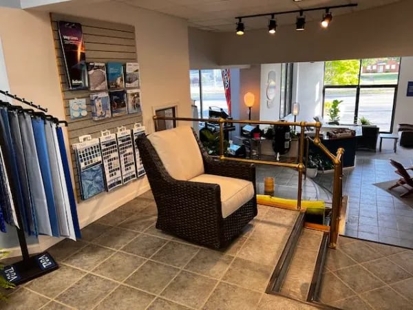
~ After ~
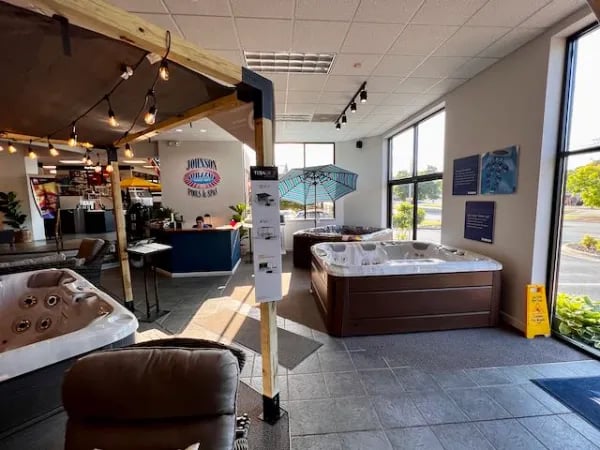
Customers are drawn to light. One of the challenges for many retail stores is how complying with energy-saving overheads gives the store a dull overall sheen. Luckily, this retailer had several light fixtures that had under-powered lights in them. Put the brightest light your fixture will allow and group those lights to create settings. To add to the idea of a party, a simple LED string of outdoor lights completes the scene and draws the eyes.
~ Before ~
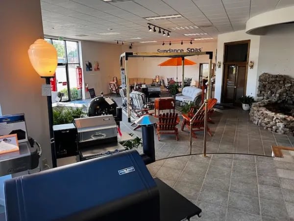
~ After ~
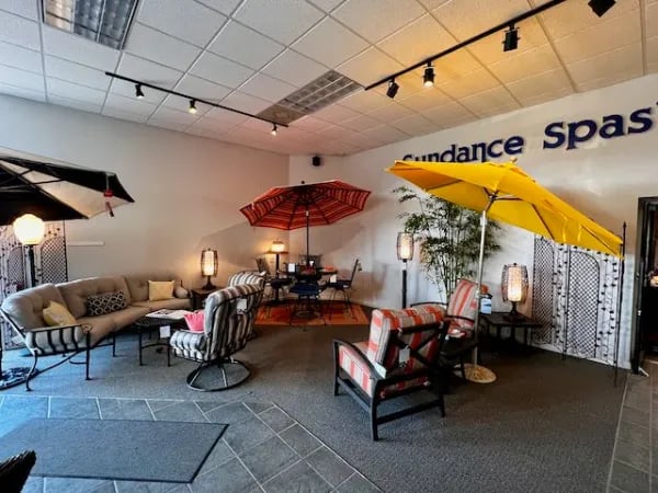
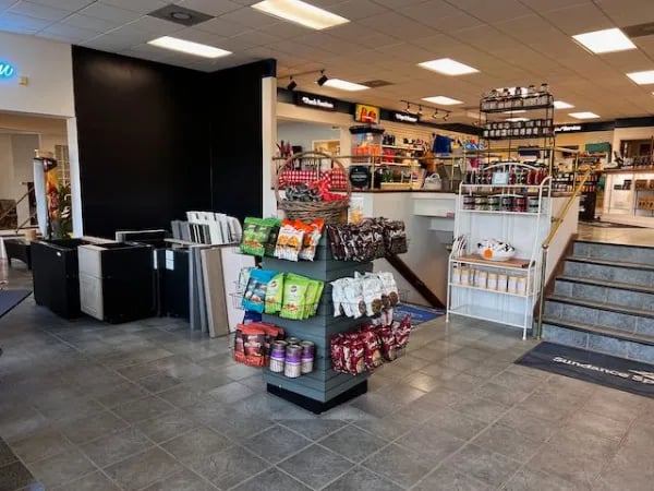
Put add-ons where they work. Previously, when a shopper entered this store, the only focal point was a rack of gourmet chips placed by the entrance. You can only interrupt customers so much to get them to buy add-ons. They must happen when the customer has wrapped up their business and is open to buying more. After all, once you say yes, it is easier to repeat it. In a post on considered purchases, I talked about how pricing can make an impulse item a considered purchase. Here, the price point was about $10, and all of the flavors of these chips were “different.” Wine chips? Pita Straws? The price and variety required the consumer to wonder what they tasted like and, as a result, weren’t selling. While we moved them, and they did better, a better impulse item requires no thought. Think of seeing Fritos instead of wine chips in the chips category. You'd know exactly what it was. It might trigger a subliminal response to want to eat a salty snack. You'd grab them and add them to your order.
~ Before ~
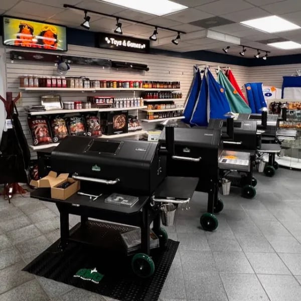
Separate similar items. Previously, all the grills and smokers were shown together, making these considered purchases look alike. By bringing the smokers up to the mezzanine area, we could bring the products that worked for smokers together with the actual smokers.
~ Before ~
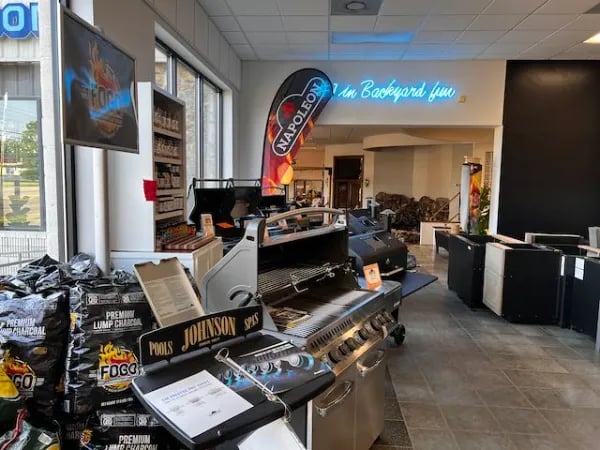
~ After ~
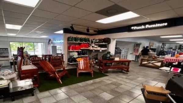
We also made a bigger statement below by putting these fabulous JJ George Cedar outdoor chairs and grill tables, made locally, together. The green artificial turf adds interest and defines the space.
Pique their interest from the moment they come in the door. An unfocused decompression zone does nothing for sales. It focuses the customer to double-down on what they came in for to avoid so many choices. How do we capture their interest and get them to consider all we carry? A floor rug topped at an angle with two bright yellow umbrellas anchored the space. Using different levels, we could tell a story about all we had for the perfect BBQ, from $100 leather aprons for pros to custom cutting boards. Customers don’t have to wonder how it all works – they see it.
~ Before ~
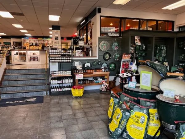
~ After ~
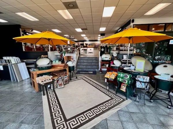
Create scenes, walls of product
Many stores put out as many products as possible, thinking it makes an impact. In furniture stores, I call this the Sofas as Soldiers approach. In this case, they had charcoal everywhere. It cluttered the store. It didn’t add to the shopping experience but took up valuable room. It is an uninspired way to organize a store. If you truly sell that much, don’t put it all out because, to the average shopper, it looks like what you have put out is not selling. We reduced it by two-thirds, which still looks like a lot, but after Father’s Day, that can be reduced further.
~ Before ~
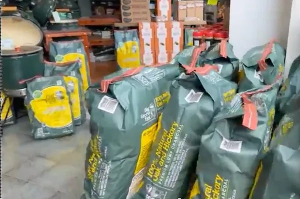
~ After ~
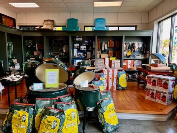
And did these re-merchandising changes to this store refresh work?
From the client, “Customers have commented how much better the store looks and feels, and several pieces of furniture that you moved sold within a few days of you being there… and this is furniture that we had for months and months with no interest. We have also sold several umbrellas and smokers that you moved to the store's upper level."
The important thing for retailers of all sizes is to realize why you do a store refresh...
Because customers are always on the hunt for "what's new."
Because your retail team will be so used to seeing the merchandise, they lose the excitement.
By just moving the front to the back or the "we've always had it there" to someplace new, you add energy to your retail store.
And the merchandise moves...
If you want to know more about working with Bob for a store refresh, use the Contact button above.
See this case study: Ecklund Farm Machinery Makeover with video here

