3 Wildly Successful Examples Of Experiential Retail Design
Subscribe to our newsletter
It’s been a tough last few months for brick and mortar retailers as many are reporting lower same-store sales like GAP, Kohl’s, and Nordstrom, while others are having increases like Target, Pottery Barn, and Best Buy.
The dreaded retail apocalypse words are creeping back into news stories as more brands abandon their flagship stores and try to hold on to customers.
Part of this is due to the myth that everyone is moving to online sales.
It just isn’t true.
In a recent WSJ video, Why There’s No Retail Apocalypse, News Editor Lee Hawkins shared data from EMarketer on how 40% of the 90% of online retail is in music and books.
While the data is murky on how much business is online, it’s not easy to see the headlines and not feel hopeless if you are a brick-and-mortar retailer.
That’s why many are looking to experiential retail to compete with online bandits.
See also: Retail Sales Strategy
What is experiential retail?
It’s when the retailer gives you a distraction in hopes you’ll find it compelling enough to want to hang out.
It is a store design divorced from the need to make a sale.
You might want to turn to experiential retail like Camp does with their secret room attached to a toy store or like House of Vans in London which has a skate park in the basement where the visitor has to do something.
For me, the delivery of experiential is oftentimes more gimmick than genuine - like being able to catch your own dinner.
Once you’ve done it, will you return? Unless the experience is genuine, I think not.
Three of the best experiential retailers and why they’re so effective
Each of these three retailers has seamlessly baked experiential retail into their entire store design. With every element of design from the entrance to checkout, the stores indulge their customers with a memorable experience that leaves their competitors in the dust.
1. Suit Supply
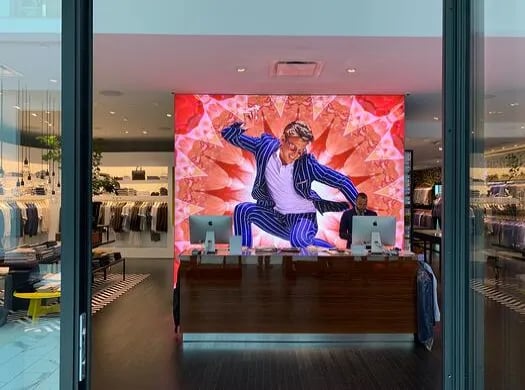
Suit Supply, pictured at the top of this post, was started in Amsterdam and now boasts about 100 men’s stores around the world.
I discovered their King of Prussia store when Devon Aimes, their store manager, invited me on a short tour and explained the distinction between custom suits, semi-custom, and their casual wear. Every item was carefully folded with novel touches like one sweater on a tray to catch your attention.
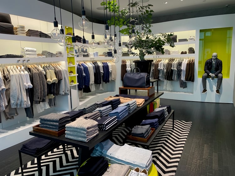
Their display tables had layers of height to show a complete picture. Lime-green cubby holes featured footwear and a bold choice of patterns in both floor and wall coverings grab your attention. I also appreciated their counter right up at the front where staff could engage shoppers immediately.
What I particularly liked about the store was the design trick of full plate-glass mirrors that made the store seem twice as big and spacious. The tailoring area at the front of the store for in-time alterations sent a clear message and added its own theater. The abundance of lighting under shelves, over shelves, and inside shelves made the merchandise seem to float. You are compelled to follow your eyes around the store and explore.
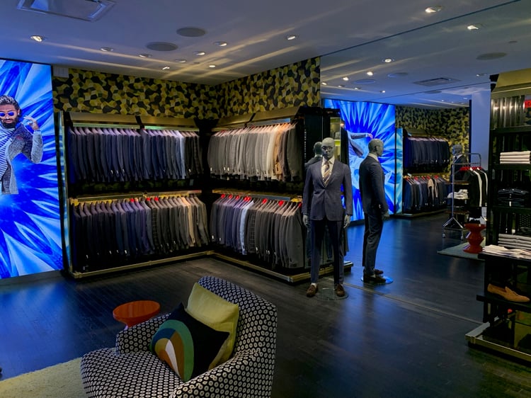
The curated color-coordinated selections are just enough to peak your interest without feeling overwhelmed.
How they get you to linger: Carefully curated merchandising, mirror tricks, and those amazing graphics.
2. RH Gallery - Restoration Hardware
This five-story, New York city showroom blurs the lines between restaurant and retail and between indoor and outdoor. Your gaze is caught by the glass elevator then swept up the atrium to the soaring glass roof.
This 90,000-foot showroom is a game-changer even though it has the same grays, browns, and neutrals I’ve seen at their stores before; here all of it is given the space to breathe. And just like Suit Supply, most everything here is spotlit, including the mirrors.
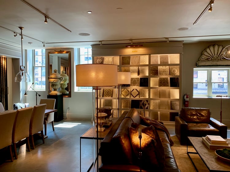
This is important because the rooms are set up to be viewed from many angles and nothing feels stuffed or slighted.
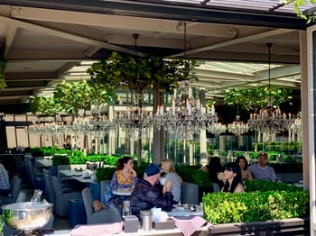 There is an elegant restaurant on the top floor that features all of their indoor/outdoor furniture and chandeliers and has sweeping views of the lower East Side of New York. On the third floor is a wine tasting and espresso bar.
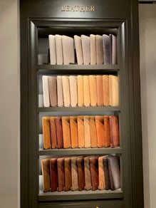 There are no sample books in view at this furniture store; options like leather receive their own spotlit gallery for easy consideration.
How they get you to linger: Food, alcohol, and windows draw you through the display showrooms, and everything is spotlit.
3. Starbucks Reserve Roastery
Starbucks popularized specialty coffee but the original novelty of espresso machines has worn off. The mammoth store I visited in the Meatpacking District of New York features Italian aperitivo bars, high-end food, deluxe decor, on-site coffee roasting, and more. Prices are more expensive than other Starbucks, and the food and drink are served in exclusive cups and trays.
Above your head, beans swoosh through clear chutes that feature blue digital monitors that read A symphony of beans and land the beans in copper-topped containers at the espresso bar.
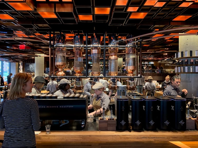
Scent is a big deal in a coffee house that roasts its own beans. While it is awesome to watch and smell the beans as they come out of the roaster, you don’t want to walk out the doors smelling like them.
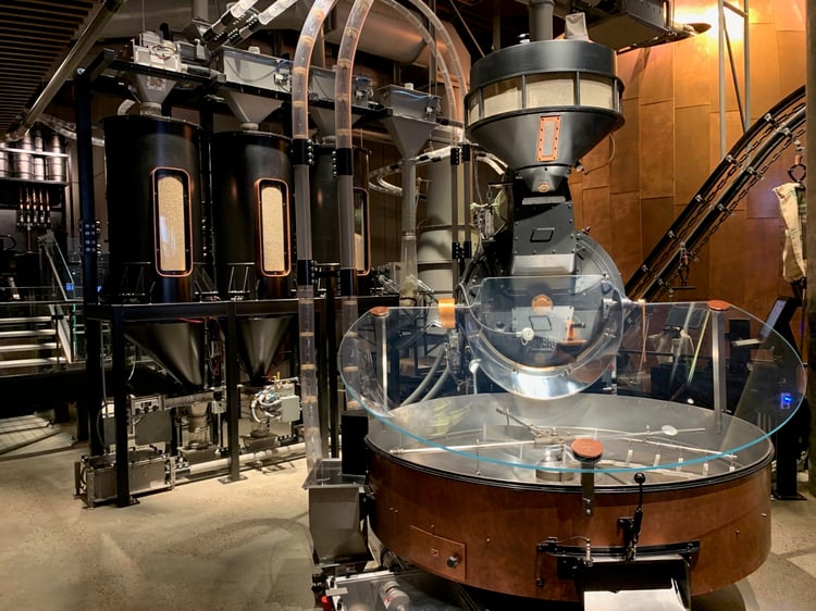
The Reserve Roastery has two roasters in this location. Downstairs, a commercial one roasts beans for all the Manhattan stores and features a plexiglass cover that captures the smoke. Upstairs, a smaller roaster roasts beans just for this location and features a high-speed hood.
The machinery is amazing to look at and those hoods capture all the smoke but leave the smell. People were lined up at seats around the commercial roaster by 10 am to witness the theater of roasting coffee.
The lighting is broken up on the ceiling with small orange squares which expands the shopper’s eyes to explore all of the levels of the facility from the artisan bakery on one side, to their coffee bar in the middle, to the roaster downstairs, and to the bar upstairs.
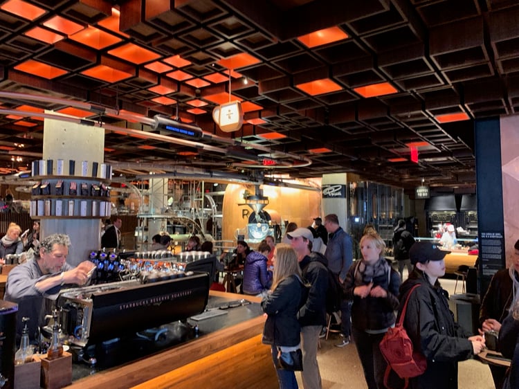
The experience is seamless and focused on getting you to linger and buy designer retail offerings as well as exclusive roasts. They have one or two employees stationed by the entrance to welcome and explain the space.
How they get you to linger: Watching the process of roasting the coffee, making the specialty bakery items, and a curated selection of retail.
See also: What’s New In Retail At Hudson Yards, Saks, STORY, And Neiman Marcus
Converting experiential retail design to sales
All three of these stores have crafted a unique vision of how to look awesome and speak to their customers. All three show how to make brick-and-mortar stores better than the internet.
But even an awesomely crafted store still has to convert each shopper into a customer.
A beautiful, experiential retail space promises a great time to the consumer, but it takes people to deliver on the promise and get those shoppers to buy and want to come back again.
The degree of experiential is up for debate when it comes to retail.
But one thing is certain, retailers that invest in authentically bringing their brand to life get shoppers to rave about it.
I know I did with these three just now.
See also:
- To Compete With Amazon Try This In Your Store Instead Of Coupons Or Discounts
- 5 Ways to Re-Engage Customers with Email
- How to Use Your Customer List as a Retailer
Take my free 5-part email course to learn how your retail store can outsell any online retailer. You can get started with your first lesson by entering your name and email address below ...


![How To Decorate Your Retail Store For The Holidays [Pics]](https://www.retaildoc.com/hs-fs/hubfs/Decorate%20for%20the%20Holidays-1.webp?width=102&height=111&name=Decorate%20for%20the%20Holidays-1.webp)