7 Retail Display Ideas Found In Los Angeles to Try In Your Store

Subscribe to our newsletter
Customers come to your brick-and-mortar store to discover something new.
They are hopeful.
They want to discover something worth the trip.
That’s where your retail store design and visual merchandising can make the difference between, “You have a beautiful store,” and “I’ll take it.”Every few months I search out the best examples of retail display ideas to share what works.
I was able to pal around last month in Los Angles with my buddy Tony Drockton, Chief Cheerleader of Hammitt Handbags, as we explored what made retail post-pandemic so exciting.
Use these visual cues to understand how to engage, delight, and more importantly - SELL - your merchandise.
Create excitement to touch
We buy produce and apparel by touching and holding them. On a basic level, being able to touch and feel the merchandise gives hesitant customers a chance to bond with the merchandise in a way online can only dream of.
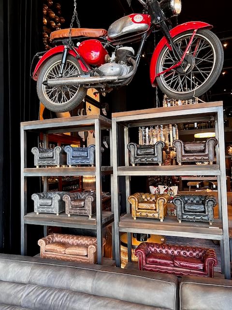
While Timothy Oulman in DTLA could use a book to show their various leather treatments, look how much smarter to have miniature couches which show the shopper exactly what the finished product would look like. Bonus, you can actually buy the samples for decorations.
Everyone who came by had to touch the leather and admire the design.
Oh and if the miniature couches didn't work, how about that red motorcycle? Bingo!
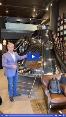
As I tend to do on exciting shopping trips - whether in New York or Dubai - I did a Facebook LIVE where you can see more of this amazing home furnishings flagship store below.
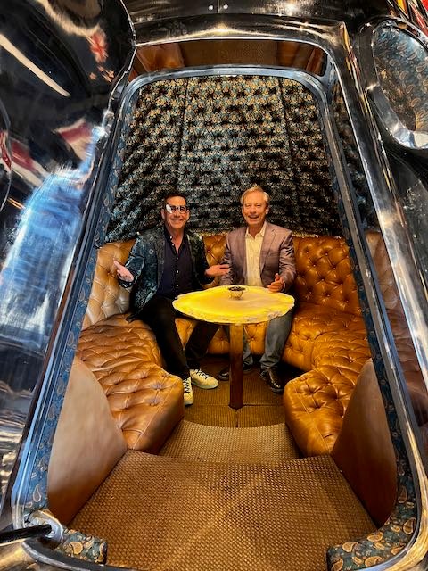
Notice the attention to detail, lack of blaring signs, and tactile design cues designed to stop the visitor in their tracks and get them to sit, examine, or just soak up the outrageousness of your very own Apollo capsule for your cool new loft...
By the way, Tony went back to the store and purchased two of these chairs he fell in love with that day...
Next up is Aesop in DTLA, a Brazilian cosmetics brand with 200+ stores.
Be a store anchored to a place
The days of cookie-cutter retail store design are over. It's the difference between getting a suit from Pennys which doesn't fit so great and going to a tailor who makes a suit just for you.
Everyone can see how well it fits.
That's what I mean by store display anchored to a place. If I'm in Munich, the store should feel like it is a part of Munich - not a West Hollywood boutique plopped down like an alien.
And when you look around, you'll see the best brands adopting this philosophy more and more.
Much like I wrote about Ted Baker's store in New York, every Aesop store design is created with a nod to their specific location.
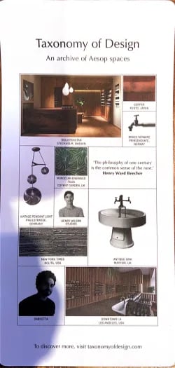
What I also appreciate is they also showed some of the design choices they made in their stores around the world in this takeaway flyer. No prices. No QR code. #oldschool And it works...
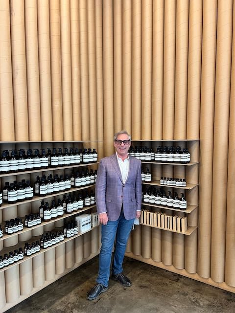
This store is located in the former garment district of downtown Los Angeles and those cardboard rolls are from actual rolls of cloth used in making garments.
Again, notice the simplicity of the store design which doesn't scream we're in the former garment district but helps you focus on a human scale of product display with nothing below the thigh and nothing above eye level.
But their retail display ideas go further than just the walls...
Show your pledge to sustainability
It is so easy to plaster a mission statement on a wall or website but how do you create less of a footprint for waste in your store through your visual merchandise displays?
I wrote about How to go Beyond the Buzzwords of Sustainable Retail to Making A Difference because so many retailers don't know the small steps they can take.
Take cosmetics companies. So many use testers or individual sealed one-use wipes for shoppers to select the scent or feel the smoothness of a cosmetic.
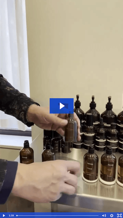
As you can see in the video I took, below, Aesop uses small soapstone under each tester that can be reused again and again.
Yes, you can’t just have this out at a big box store, but in a boutique setting the associate guides the shopper experience and explains the testing procedure.
Have a wow display
I've said it many times, if I had my choice I would have the equivalent of a shiny '59 Cadillac in the first 1/3 of my store lit with spotlights to really make the chrome shine and a red carpet leading to an open door that would welcome the visitor.
Oulman did the equivalent with this over-the-top personal chrome Apollo capsule complete with stairs. Again, watch the video below!
Inside it feels a bit like being in I Dream of Jeannie's bottle but incredibly comfortable and conversation starter.
Another plus with a great display like this? Customers linger.
It's time to hit eject on the "but customers just want to get in and get out quick" theory so prevalent in retail these days.
Customers are eager to be engaged through design and curation. And no, neither of us got one...yet.
Sustainability with respect for the past
Urban planners call this adaptive reuse. It is where a building that formerly functioned as a warehouse, or a manufacturing facility, or in this case a former movie palace, the Tower, takes on a new life.
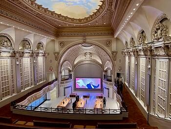
Apple spent millions to make this vintage movie palace the stunner it is. Apple's mammoth brand has led to some of the most stunning retail estate being turned into even more stunning retail outlets.
This is how it looked four years ago when I visited...
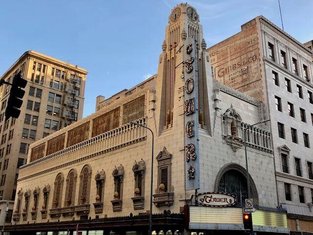
And today on Apple's website for their Tower Theatre location.
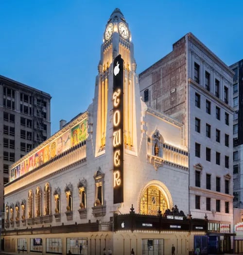
Who doesn't feel the pride of the brand at such a transformation? Dark for 33 years and brought back to life, this beacon of what is possible will generate foot traffic and additional interest in opening downtown.
I bought something and plenty of other people were thrilled to look at the building and the products.
It doesn't have to be one or the other.
Again, the goal of great store design and retail displays is to get the shopper to slow down, consider something they hadn't previously, and linger. That's where the money is ... in lingering.
Curate your merchandise
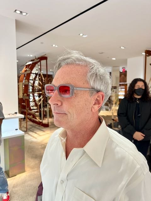
Gentle Monster is a Korean eyewear company with about 40 stores worldwide. Each is different because artists who make the eyewear also come up with artwork in the store. Notice how few of the glasses are shown, how they are backlit, and how the lenses draw your eye to the frames.
They have a simple request that when you try them on, you place them back at a right angle so they can be cleaned for the next person.
Less is more, don't you think?
Here is a Facebook live I did when I first visited...
On this last trip in February, I had to get another pair...
How to attract more customers? Stand out on the street
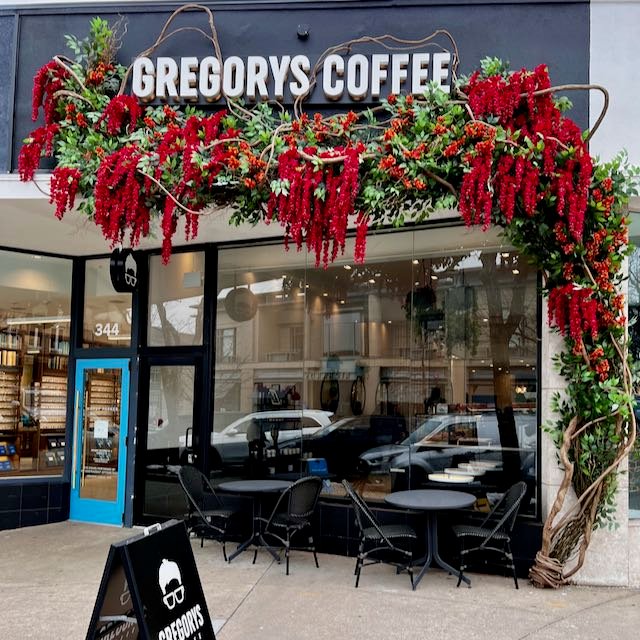
So many retailers' style is compromised by their street location becoming boring retail boxes. That's why I loved this exterior of Gregorys Coffee.
Adding the fake vines and flowers draws 3D attention to the store and the bright colors make you pause and notice the business.
Are those flowers? Are they coffee beans?
Who knows but smart retailing draws the ideas...
Creating great retail displays isn't hard. DIY retail display ideas are all around and can be both inspirational and copied.
As long as you understand your goal is to get the shopper to stop, consider, come inside, and linger.
For more tips on how to visually merchandise your store, visit my page on Retail Merchandising.

.webp?width=102&height=111&name=Map-NYC%20retailers%20(1).webp)
![Retail Store Merchandising Ideas to See in New York [Pics]](https://www.retaildoc.com/hs-fs/hubfs/IMG_0872-reddywindows.webp?width=102&height=111&name=IMG_0872-reddywindows.webp)
